SELECTING OUR SOURCES
To investigate air and water quality, we worked with data from CalEnvironScreen 2.0 and 3.0. These campaigns were two iterations of an environmental screening tool created by the CalEPA and California State Department containing comprehensive data on pollution indices, demographic information, health, geography, and other pertinent variables. This dataset parameterized air quality through PM2.5 concentrations and water quality through a drinking water contamination index.
To investigate greenspace, we used tree canopy data compiled by scientist Jarlath O’Neil-Dunne at the University of Vermont’s Spatial Analysis Lab. Greenspace data provided another dimension to environmental justice and allowed us to compare and contrast any observed trends between air quality, water quality, and percentage of tree canopy.
Before interpreting our data, we considered potential silences in our data that could arise from collecting raw data (e.g. having enough instrumentation or infrastructure to collect air or water quality measurements); compiling data into clean and interpretable datasets (how finances or institutions can create bias); and interpreting the data in the context of our project. Trouillot's Silencing the Past provided the theoretical framework for our critiques. More information about the data can be found on our Data Critique page. Furthermore, we centered our research questions around race/ethnicity and socioeconomic status to amplify marginalized voices. While brainstorming the project, we continually acknowledged that data is subjective and a product of societal power dynamics (as expressed by D'Ignazio and Klein's Data Feminism) and sought to use data to empower marginalized communities.
Along with these datasets, we read various peer-reviewed sources about environmental injustice to provide a scientific and humanistic foundation for our narrative and visualizations. For instance, we read articles about the history of environmental injustice, how pollution affects human health, and how oil drilling and forestry affect pollution. We synthesized these sources to gain a better understanding of how pollution is distributed across Los Angeles. More information regarding our sources can be found in our annotated bibliography.
PROCESSING OUR DATA
The dataset we used was relatively clean, with very few huge outliers or null values; however, we still did some minimal cleaning using Deepnote. To create our data visualizations, we used Tableau, R, Leaflet, and Python's Matplotlib/Seaborn & Numpy libraries. Many of these visualization tools were used due to each member's familiarity with the language: some came in with R knowledge, while others were more comfortable with Python or Tableau. Nevertheless, despite the varied visualization tools, we created our visualizations while taking into account the type of data being represented (whether it was qualitative or quantitative), the number of variables plotted on each graph, and how these visualizations fit into our overall narrative. Finally, each tool's strengths and weaknesses were considered when creating these visualizations: Python allowed for quite a bit of customization, R was better suited for more sophisticated statistical analysis, while Tableau created interactive visualizations with little coding.
We also used Timeline.js to describe the history of environmental justice in Los Angeles; this tool was useful because we could incorporate visuals into an interactive timeline, making historical data more engaging and user-friendly.
PRESENTING OUR NARRATIVE
We used website-designing software Mobirise to design our website rather than Wordpress due to Mobirise's flexibility and free themes. We chose a lighter theme, dark fonts, and a green color scheme because it increased the text's contrast and better showcased our images and data visualizations, many of which had white or grey backgrounds. We also wrote alt text for each visualization and map and inserted hyperlinks on descriptive text to make the the website more screen-reader friendly. Finally, we made sure that any headers were written as actual HTML headers rather than bolded text to allow screen-readers to quickly sift through our sections.
Although the website was created with Mobirise, we hosted the files on GitHub Pages and used git for version control; the latter was important since our group consisted of six members simultaneously working on the same pages. Additionally we directly modified the HTML files in Visual Studios Code to embed the timeline and interactive maps.
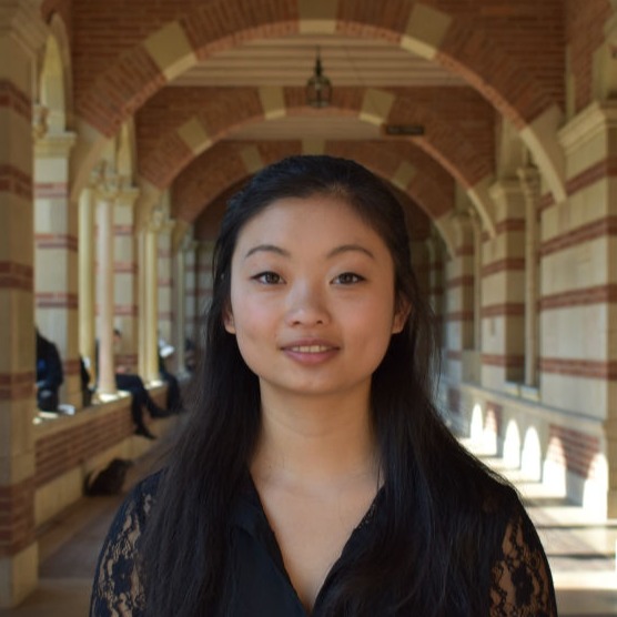
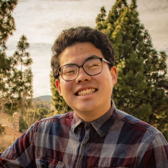
Hi, my name is Jeremy and I am a 3rd year Computer Science major from the Bay Area. As the project manager, I was in charge of scheduling meetings and dividing tasks. I also helped with creating the website which involved designing the About page and embedding the Timeline.
My favorite trees are maple because of their deep red color!
Hello, my name is Justin and I am a 3rd year Cognitive Science and Statistics major. As the Web Designer, I was in charge of setting up the website, working with HTML, CSS, and other tools to host and create the layout of the website.
My favorite trees are oaks!
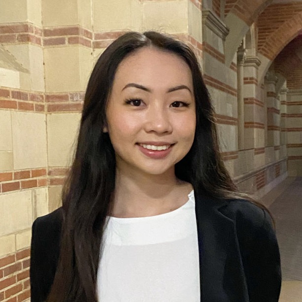
Hi, my name is Vivian and I’m a third-year Los Angeles native majoring in statistics and sociology with a specialization in computing! As the project data specialist, I was responsible for cleaning and refining the data set so that it was standardized and usable for analysis.
My favorite trees are ginkgo bilobas!
Hi, thanks for visiting our website! I’m Mark, a 4th year Computer Engineering major from LA! My focus as the data visualization specialist was to check off and make sure that every chart, graph, etc was top-tier, clean, and understandable! I did my best to learn the tools and software platforms that would help us create these data visualizations and made sure my team was equipped with the knowledge to put out their best work as well!
My favorite trees are sequoia trees!
Hi, I'm a 3rd year Computer Science major from the Bay Area. As content developer, I help oversee the site's main narrative, integrate the data visualizations with our content, and work with all team members to complete our project.
My favourite trees are cherry trees!
My name’s James Yoon, and I’m a fourth year chemistry major with minors in atmospheric & oceanic sciences and professional writing. As the project editor, I was in charge of editing all of our written and visual content and developing a coherent narrative across our data visualizations. I'm passionate about air pollution and atmospheric chemistry, so it was awesome getting to apply my interests to a digital humanities project.
I’m a big fan of Japanese cedars!
We'd like to thank the following people for their invaluable help on this project.
Design a website with Mobirise